Tag Archives: Vincente Minnelli

Helen Rose’s dresses and designs for Designing Woman (Vincente Minnelli, 1957)

Helen Rose was MGM’s chief designer from the late forties to the late sixties and designed many of MGM’s major films throughout the fifties. She worked with Minnelli on Father of the Bride, won an Oscar for his The Bad and the Beautiful and also did The Long Long Trailer. The Cobweb (uncredited) and other of his films. In her day she was perhaps most famous for designing the wedding dresses for Elizabeth Taylor’s marriage to Nicky Hilton and for Grace Kelly’s marriage to Prince Rainier of Monaco.

The story of Designing Woman was suggested by her and in a short film that accompanies the Warner Home Archive version of the blu-ray, she speaks of trying to make chic, flattering but basically simple clothes, the outfit basically a setting for the woman, like the setting for a jewel.  I find her clothes do the opposite of this,.They’re fussy, often bordered by useless frills or statement enhancements like mink. The clothes move well but are not properly fitted and sometimes bunch up in the most inappropriate ways and in the most inappropriate places. The backs tend to be bunched up hideousness.  I like her sense of colour, but they’re designs that are best seen at a distance. She’s not generally ranked among the major designers of the classic era (Adrian, Orry Kelly, Travis Banton, Irene, Edith Head, etc.) She’s also not represented in Deborah Nadoolman Landis’ Hollywood Sketchbook: A Century of Costume Illustration. That said, there are images below where you’ll see how glorious Lauren Bacall looks in them.

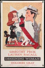
I offer the images below not as an analysis but mainly as a teaching tool. This is a film about a designer where the designer of the film is based on not only gets to design clothes for its two leading ladies (over thirty changes for Bacall alone) but also gets to create a fashion show in the middle of the film. I’ve provided images for all the outfits,  from various angles, and in chronological order, partly because they are a pleasure to see, and partly because it might be a useful teaching tool to some of you.

Helen Rose and her Designs:


Lauren Bacall’s Changes of Outfits in Chronological Order and viewed from different angles:


Dolores Gray’s Outfits, also in chronological order and viewed from different angles.


The Fashion Show, also in chronological order and viewed from different angles.

José Arroyo

Designing Woman (Vincente Minnelli, 1957)

DESIGNING WOMAN got good reviews and Lauren Bacall claimed it as a favourite role. When I saw it last night – and in spite of the visually gorgeous Warner Home Video version – I found it hard to understand why. It had all been done more expertly, with greater lightness and depth, in George Stevens’ WOMAN OF THE YEAR (1942).It’s perhaps no accident that Bacall would be attracted to the role of Tess Harding, and have a big hit with it as a musical on Broadway in 1981.  If you can forget the controversial ending, Woman of the Year seems a masterpiece next to DESIGNING WOMEN. Bacall and Gregory Peck sink every joke here. They’re game but no cigar. No circus going on in THEIR heads when they say those lines either.

Minnelli makes everything look beautiful. Peck and Bacall ARE beautiful but…. In some ways this career woman vs sports writer offers an interesting exploration of masculinity but a tentative one that backtracks at every opportunity. Here, a choreographer played by the great Jack Cole, himself the choreographer of the film, defeats a whole mob of gangsters with dance steps…but he reassures everyone that he’s married and a father of three. And if you already haven’t gotten the message, he’s named Randy Owens. The film is an interesting commentary on appearances and very Minnellian for that but also a liminal step out of the closet that backtracks into it at the highest speed possible. The story is autobiographical and suggested by designer Helen Rose, my least favourite Hollywood designer. She has a great sense of colour but the dresses all bunch up in the most inappropriate and least flattering places. I was sorry I’d shelled out so much to get the film, however beautiful the version.

It’s perhaps a measure of the film’s limitations that it takes one cute poodle joke and doesn’t know when to stop:

José Arroyo

A note on ‘Two Weeks in Another Town’

I’ve just seen Vincente Minnelli’s Two Weeks in Another Town (1962) in the lovely Warner Archive version. The film is an adaptation of Irwin Shaw’s novel, produced by John Houseman and filmed by Milton Krasner. There is much to enjoy: it’s knowing look at filmmakers and filmmaking; at the industry and the art; its connection of art to orgies; it’s melodramatic excesses; it’s self-referentiality , particularly in relation to Minnelli’s The Bad and The Beautiful (1952); its documentation of Cineccita and the Via Veneto in the Hollywood-on-the Tiber period. But all of this has been much written about already and I here just want to point out a few things that caught my eye:

To a cinephile, one of the most enticing aspects of the film is to see how films were made in the period: the cranes, the lights, the creation of rain, the script, the screening rooms, the editing rooms, the Steenbeks, the way cameras were hooded to protect them against the rain (see Gallery below).


Cyd Charisse, aside from wearing a diamond ring as big as the Ritz and a rivière of diamonds like nothing you’ve ever seen except on British royalty, wears Balenciaga throughout. Balenciaga also dressed Kay Kendall in The Reluctant Debutante for Minnelli in 1958 and it made me wonder if there was a special connection between the director and the couturier.

Cyd Charisse’s nightgown matches her bedding. How standard was this practice in Hollywood filmmaking of the period? Was there a house style and a period practice that made this a dominant or is this exceptional and Minnellian?

The orgy scene in the film is very understated, only suggested but absolutely clear. It would make for an interesting comparison between Fellini’s La Dolce Vita (1960), which it is clearly referencing, and the opening sequence of Paolo Sorrentino’s La Grande Bellezza (2013)

The film has very subtle use of Mirrors to enhance space but also to symbolise:

Minnelli creates beautiful compositions:

that break up the Cinemascope frame, often through a central focus, like the coffee pot in the dubbing studio here:

he attempts to create depth of field through staging in space as in here:

Milton Krasner, who had previously photographed Home from the Hill (1960), Bells Are Ringing(1960), The Four Horseman of the Apocalypse (1962) for Minnelli, does a superbly varied job here bringing in a whole array of lighting strategies, including, as you can see below, noir:

The film contains archetypal Minnelli themes: the connection between fantasy and reality, internal turmoil and external expression, the value of art in release and communication, form leading to and creating human connection:

or the connection of the half-human/ half-mythological creature to the character played by Cyd Charisse, her destructive allure rendered mythological through the Griffin-type statue.

I was quite struck with the technology, as in this image, where in the background the waves, clearly back projected are in constant movement, where the fisherman, although they occasionally do move, are still for so long they seem a 19th century shadow play:

the film is marred by the constant referencing of Minnelli’s previous The Bad and the Beautiful, also produced by John Houseman and starring Kirk Douglas, as a work of art. It seems arrogant and self-congratulatory.

and it is cited not only directly as here, but also with a rhyming nervous breakdown in a car as you can see here:


this is the sequence with Lana Turner in The Bad and the Beautiful that it is clearly referencing:

Lastly,

I wonder if Lillian Burns, MGM acting teacher and wife of George Sidney, taught Cyd Charisse how to pull back her head and laugh. In other words is this a tick common in all the MGM female stars of this period or is Ava Gardner being referenced in Cyd’s performance. I wager on the latter. Though on second thought, isn’t this a signature gesture for Rita Hayworth in Gilda also?

José Arroyo

A note on an image from the 1954 A Star is Born

Screenshot 2020-01-22 at 10.11.56

Like with the greatest of films, every time I see the 1954 version of A Star is Born, I notice something new. This time, the great shot above, which seems a noir rendering using as background the shade of green so often deployed by Edward Hopper in his paintings (see below), and even in his rural or landscape works:


What makes the shot so poignant is that the shadowy embrace against the Edward Hopper green is their entrance to their honeymoon hotel. The first night of their marriage is already imbued with suggestions of sadness, loneliness, alienation, of imprisonment in/and shadows. This had already been foreshadowed earlier by the notice of their marriage dissolving into an image of prisoners behind bars (later turned into a joke with the knowledge that the room the judge is marrying them also contains a jail). See below:

Screenshot 2020-01-22 at 10.10.55

Prison bars feature heavily in the film, particularly and most obviously in the scene where Norman Maine (James Mason) ends up in jail:


But the whole film partakes of aspects of a noir aesthetic, from the Bleue Bleu nightclub to shadowy lighting to LA nights where neon illuminates the darkness (see below)


The film also contains as many references to then ´Modern´painting as Minnelli´s An American in Paris (1951). Rousseau, Dégas, Renoir, Toulouse Lautrec, all are referenced backstage in the Shriner Auditorium sequence, and later on we even get a Mondrian image from the ‘Born in a Trunk’ number (see below):

The film is made up of such purposeful patternings both in referencing a history of art but also in deploying particular aspects of noir lighting as part of its mise-en-scène. What the first image shown above tells us is that this marriage is doomed from the very beginning. It will have passion, it will have beauty, but it will also be full of the darkness where addiction and self-hatred create a prison from a home, one that even love can´t breach. It´s all there in that first image that marks the start of their honeymoon.


José Arroyo


The Cobweb (Vincente Minnelli, USA, 1955)

the cobweb


One of those all-star multi-strand melodramas so typical of the 1950s (Not as a Stranger, The Best of Everything, This Earth is Mine). But this one directed by Vincente Minnelli, and perhaps only he could get away with structuring all of the drama around the hanging of drapes: Mrs. McIver (Gloria Grahame) wants some chic ones from Chicago; Miss Inch (Lillian Gish) wants some practical ones, at a discount; and Doctor McIver (Richard Widmark) and Miss Rinehart (Lauren Bacall) have a project to get the patients at the psychiatric institute (Jon Kerr, Susan Strasberg, Oscar Levant etc) to design their own. Charles Boyer is Dr. Devanal, the former head, now usually too soused to do much except letch around between institute and motel room , spicing up the intrigue and thickening the plot as the drapes go up and down.

Screen Shot 2017-12-09 at 14.44.04.png
Gloria Grahame

The standout performances are Grahame’s, all seething sexual frustration as the girl who every guy but her husband is hot for, and Gish who does something much deeper and complex with her performance of Miss Inch, the administrator desperate to be needed and hiding it all an aggression born out of a lifetime’s neglect.

The worst performance, and its worth mentioning because she spoiled so many 50s movies, is Bacall’s. She’s a sour, haughty and humourless presence here as in so many movies of this period (Written on the Wind) and later (Murder on the Orient Express). Here she looks great, which hasn’t always been the case when photographed in colour. But even her glossy tawny looks can’t hide a performance that is all attitude without emotion and seems composed entirely of poses.

Screen Shot 2017-12-10 at 10.47.43.png
Bacall *looks* spectacular


In interviews, Bacall’s talked about how in this movie Minnelli cared only for drapes and the only thing he contributed to her performance was to move her knee from one side to the other. What she doesn’t mention is that that’s probably the best anyone could have done for her (See her performance in How to Marry a Millionnaire — at least *here* she’s photographed beautifully and looks terrific). Minnelli knew about drapes and about moving the camera and arranging people within the cinemascope frame in ways that are still tremendously exciting to watch. What Bacall accuses Minnelli of is in fact what she herself is guilty of: great surface with nothing evident underneath.

Screen Shot 2017-12-09 at 13.31.45
Sadness, doubt, regret, vulnerability, force of will: all mingle in Lillian Gish’s wonderful face, surely one of the most expressive in film history.

Readers interested in questions of the representation of gays and lesbians in cinema might find it interesting to know that the character played by Oscar Levant, Mr. Capp, was a homosexual fixated on his mother in William Gibson’s original novel. The Hays Office prevented the character from being so characterised in the film. Perhaps because of that, Minelli visually coded the character of Mrs. Delmuth as lesbian in what for the 1950s passed as the strongest and most clichéd terms possible: with the short hair, the men’s shirts and in jodhpurs, wearing riding boots, and later on in the film, at the woodwork shop, working at her lathe. The title of Mrs. a cover and alibi for the visual representation where dress nonetheless trumps address. I at first and tellingly thought the part of Mrs Delmuth was played by Mercedes MaCambridge, one of the most vibrant and exciting signifiers of lesbianism in 50s cinema, but I see that the role is actually played by Jarma Lewis. The confusion is, as I hope you can see below, understandable.

James Dean was originally cast as the troubled young artist but studio politics prevented the casting. John Kerr, who would subsequently be cast as the the young man accused of homosexuality  in Tea and Sympathy, is dull in spite of all the histrionics his character is given to perform, rather a feat.

If the film is a visual treat, the sounds are no less of an achievement: According to Laurence E. MacDonald in The Invisible Art of Film Music: A Comprehensive History, the score for The Cobweb is ‘basically atonal’ and is considered to be ‘the first Hollywood film score to contain a twelve-tone row. The main-title music features two elements that return throughout the score: agitated figures for strings and glissandos on the kettledrums. These elements account for much of the impact of this score, which is understandably a difficult listening exercise for viewers’ (p. 157′)

José Arroyo


A Hundred Or More Hidden Things: The Life and Films of Vincente Minnelli

minnelli

Lots on Minnelli’s being ‘effeminate’ and on his wearing of eyeshadow in public places but still interestingly inconclusive on his sexual orientation. I find it so interesting how in current discourse anything other than ‘queer’ is kind of looked down upon, and yet there is this desperate insistence on claiming anything slightly effeminate as homosexual, which to me is almost the opposite of the fluidity ‘queer’ is supposed to espouse. I find it intriguing and amusing in equal measure.An enjoyable book that’s illuminating on his life and career; there are better — though not yet enough — books on his films.


José Arroyo

A Thought on Vincente Minnelli

minnelligarland


Re-watching An American in Paris on TV now makes me wonder if Vincente Minnelli was the most popular of 1950s directors; the Steven Spielberg of his day? I note from wiki that Father of the Bride was the no. 5 box office hit of 1950, An American in Paris was no. 5 in ‘51, The Bad and the Beautiful was no. 2 in ‘52, The Long Long Trailer, 13th in 1954, Gigi no 5 and Some Came Running at 9 both in 58, then Designing Women, Tea and Sympathy, The Band Wagon, Father’s Little Dividend and many more were also considerable hits that decade. Even if wiki is not entirely reliable, it’s a thought.


José Arroy

A Thought on a Moment in Meet Me in St. Louis (Vincente Minnelli, USA, 1944)

In a lovely note on his memories of seeing Meet Me in St. Louis as a four year old in 1951, critic David Ehrenstein writes, ‘I didn’t understand what was going on in the Halloween sequence. But then neither did (Margaret) O’Brien’s character, ‘Tootie’. She’d elected to ‘kill the Brokoffs (neighbors who lived down the street on the beautifully detailed set) by throwing flour at them as demanded by the other children. Walking away from the bonfire, wind and shadows whipping around her, she’s clearly terrified.’ But she succeeds, runs away from the Brokoff house and to her gang, the community she is now a part of, and is accorded the ultimate accolade of being the most horrible. ‘And indeed she is,’ remembers Ehrenstein,  ‘But that was in 1945. And that was in 1951. And now it’s 1998. And I’m dreaming of MGM’[i] It is now 2014 and MGM musicals in general, Meet Me in St. Louis in particular, and the Halloween sequence most precisely, are still the stuff that dreams are made of.

fig A
fig A

Amongst the many pleasures of watching the very greatest films over and over again is that the remembered pleasures are anticipated but also re-experienced as if for the first time. I remember sitting behind a gaggle of girls at a screening of Titanic and when Kate Winslett and Leonardo Di Caprio are holding onto the ice-flow one of the girls said, ‘Shh, this is the moment were we cry’; and then Di Caprio died and they did, loudly. But one of the joys of re-viewing great films is that whilst re-experiencing remembered pleasures one also discovers new things about the film, new reasons as to why those pleasures occur in the first place. Sometimes, it can just be that you’re at a different point in your life and the films mean something different to you; other times that you see things you’ve not quite registered before (it took a few times for me to delight in the frozen bloomers in Meet Me); other times still, that you notice elements that enhance your understanding of why the film in questions achieves its particular effects. After all, it’s not magic or alchemy; someone arranged, orchestrated, chose.

fig b - Mr. Brokaff by the window as if from Tootie's point-of-view.
fig b – Mr. Brokaff by the window as if from Tootie’s point-of-view.

Seeing Meet Me in St. Louis for the upteempth time earlier this week I had one of those moment of – revelation might be too strong a term – let’s say insight into why the Halloween sequence, a sequence without a ‘number’ in a musical, remains so memorable. Minnelli claimed that that sequence was the principal reason he did the film[ii]. And it’s a sequence justly famous for its formal elegance — the crane shot at the beginning, the long slow travelling shot as Tootie heads towards the Brokaffs, the much more quick rhyming shot heading back to her gang once she’s succeeded in killing Mr. Brokaff – its technical complexity – the orchestration of all of those elements, often within a shot, and which focuses on a child – the achievement of such varied effects –fear, humour, relief, excitement, creepiness, tension – all the while tying in to the theme of a child excluded from her community, sent on a dangerous quest, overcoming her fear, accomplishing her mission, and returning in triumph to be admitted into the group and garlanded as one of its heroes that but foreshadows the threat to the whole Smith family that Mr. Smith will announce at the end of the ‘Autumn’ sequence to the film, just after the Halloween sequence and before its triumphs have been fully savoured, as a ‘move to New York’.

Tootie enters the shot from screen righ
Tootie enters the shot from screen right

The moment I want to point to is but a simple cut; or rather how the elements surrounding that cut are orchestrated. It takes place immediately after the long shot where Tootie is slowly and fearfully heading towards the Brokoff house (see clip above for a view of part of the sequence). Her friends and  the fire they are feeding have completely receded into the background. She’s already passed that horse that has scared her so and has made us laugh. The shot ends with Tootie looking fearfully at the house (see fig. a), we’re then shown the house as if from Tootie’s point of view (see fig. b) but then we’re shown that it couldn’t be Tootie’s point-of-view as we see her enter the shot (fig c).

Now, what’s gained by this? Minnelli could have shown us the house, then returned to Tootie and then showed us Tootie heading towards the house; Or we could have seen Tootie gazing at the house and then cut directly to Tootie heading toward the house. What’s gained by showing us the house first as if from Tootie’s point of view and then having Tootie enter the shot (i.e. it becomes a false point-of-view shot). Watching the film this week I posed myself these questions for the first time;  and of course, the answer is simple: it’s to achieve particular effects, it’s why we feel what we feel when watching that moment.

Tootie’s scared, she looks at the house with fear; we then see what she sees: a massive house shown from a low angle and with a wide lens to make it as imposing as possible. The choice to have Tootie enter that scary image has the effect of showing us that Tootie’s scared, she’s not wrong to be scared but, aware of the dangers, she confronts them and enters into the realm of action. That’s why Tootie is the ‘most horrible’ why it doesn’t matter that she’s a girl or that she’s smaller. That minute difference of where, how and on what to cut makes a huge difference in how we see and evaluate what Tootie does. It makes her seem conscious, aware, courageous. She knows that it’s an arena of danger, chooses and acts in spite of her fears. It’s marvellous. And it’s one of a whole array of minute but decisive choices that makes Meet Me in St. Louis such a great film.

José Arroyo


[i] David Ehrenstein, ‘David Ehrenstein; writer, critic’, Film Quarterly, Vol. 52, No. 1. (Autumn, 1998), pp. 59-60.

[ii] Gerald Kaufman, Meet Me in St. Louis, London: BBI, 1994, p. 53.

Love theme from Les parapluies de Cherbourg (Jacques Demy, France, 1964)

I’m a sap. I know. But this gets to me every time. The music is by Michel Legrand. Catherine Deneuve is the young girl in love. The almost as beautiful Nino Castelnueovo is the young man who loves her back but is conscripted into two years of military service. You might note the influence of the MGM musical: –the streets were painted so that the colour scheme could become one of those largely unnoticed but crucial elements that create meaning and feeling in movies — perhaps excessively so: see how in the bar the drink on the table matches the background yellow. Vincente Minnelli was a particular influence on director Jacques Demy and you can detect it in the use of background, décor, costumes and particularly in the flowing camera movements. Everything is consciously put in the frame, everything signifies — that’s why we feel it so deeply. The end, when the couple seems to be floating on air, is particularly lovely — and significant — as the rest of the film is about how all those young dreams are crushed. For many years that type of shot with the camera maintaining equal distance from the characters whilst they seemed to move seamlessly, as if standing still on an a moving sidewalk, was often to be found in Spike Lee’s films but with lesser impact and effect. Seeing it on its first release and far away from home, Kurt Vonnegut wrote his wife, ‘I saw Umbrellas of Cherbourg, which I took very hard. To an unmoored, middle-aged man like myself, it was heartbreaking. That’s all right. I like to have my heart broken[1].’ One of the great musical numbers of all time and a very wonderful film.

José Arroyo


[1] Kurt Vonnegut, Letters, Edited and with an introduction by Dan Wakefield, London: Vintage Books, 2013; p. 107.