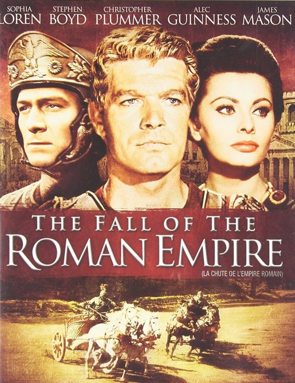
I´m a great admirer of Anthony Mann. He´s not only the director of some of the greatest Westerns ever but a kind of celebrity in Spanish pop culture as he married Sara Montiel, the reigning diva of Spanish Cinema of the late fifties to Mid-sixties. The producer Samuel Bronston, is also an important figure, bringing in to Spain big-budget runway productions such as El Cid (1961)and 55 Days at Peking (1963)and, along with them, lots of money and employment. I somehow missed The Fall of the Roman Empire. I enjoyed it very much but would have to see it again to offer more valuable observations.
The one thing that led ,me to write the post is that I was idly watching the film and thought, ‘oh those hills look just like the ones of the area in Spain I was born into’. Then I search in wiki and realise the film was indeed shot there. And it was weird to see *my* landscape figured by all those blond blue-eyed faces: Stephen Boyd, Alec Guinness, John Ireland, Christopher Plummer, Mel Ferrer. Even Omar Shariff, Sofia Loren and James Mason, though darker and more plausible, didn´t quite fit in.
It was a kind of blondfacing of landscape, a cultural erasure where the world belongs to some types of faces — at home in and ruling all kinds of landscapes — and not to others. Of course I grew up watching this kind of thing in Canada, where Montreal and Toronto stand-in for New York and British Columbia stands in for Colorado or whatever. But this felt different somehow, the landscape of the Sierra de Guadarrama standing in for an ancient Rome peopled by lbondes (at least the red hair of the invading German Barbarians was motivated by the plot). A thought, though one probably not worth very much as millions of Syrians are denied safety in Turkey and in Europe.
Like with the greatest of films, every time I see the 1954 version of A Star is Born, I notice something new. This time, the great shot above, which seems a noir rendering using as background the shade of green so often deployed by Edward Hopper in his paintings (see below), and even in his rural or landscape works:
What makes the shot so poignant is that the shadowy embrace against the Edward Hopper green is their entrance to their honeymoon hotel. The first night of their marriage is already imbued with suggestions of sadness, loneliness, alienation, of imprisonment in/and shadows. This had already been foreshadowed earlier by the notice of their marriage dissolving into an image of prisoners behind bars (later turned into a joke with the knowledge that the room the judge is marrying them also contains a jail). See below:
Prison bars feature heavily in the film, particularly and most obviously in the scene where Norman Maine (James Mason) ends up in jail:
But the whole film partakes of aspects of a noir aesthetic, from the Bleue Bleu nightclub to shadowy lighting to LA nights where neon illuminates the darkness (see below)
The film also contains as many references to then ´Modern´painting as Minnelli´s An American in Paris (1951). Rousseau, Dégas, Renoir, Toulouse Lautrec, all are referenced backstage in the Shriner Auditorium sequence, and later on we even get a Mondrian image from the ‘Born in a Trunk’ number (see below):
The film is made up of such purposeful patternings both in referencing a history of art but also in deploying particular aspects of noir lighting as part of its mise-en-scène. What the first image shown above tells us is that this marriage is doomed from the very beginning. It will have passion, it will have beauty, but it will also be full of the darkness where addiction and self-hatred create a prison from a home, one that even love can´t breach. It´s all there in that first image that marks the start of their honeymoon.
A long, wide-ranging and informative discussion with scholar Adrian Garvey on the career of James Mason , the subject of Garvey´s interest and research for over a decade now. We touch on various aspects of the particularities of Mason´s career and achievements but with a particular focus on his work in the UK in the forties, and then in the United States in the 50s. The conversation ranges from the differences in his level of stardom in the UK and the US, his choice of projects, the quality of the people he sought out to work with, how a star becomes a lasting star in spite of never quite becoming a box-office star in America, what his star persona was in the UK and how that was re-deployed but also re-inflected in America. We touch on the directors he worked with: Reed, Ophuls, Hitchcock, Kubrick, Minnelli, Nicholas Ray; we compare his career to that of other British stars of the period and after– Stewart Granger, Dirk Bogarde, John Mills, Richard Burton, Peter O´Toole, Richard Harris, Alec Guiness…. A must-listen for anyone interested in James Mason.
The Deadly Affair (1967) seemed such an enticing project: Sidney Lumet early in his career directing an adaptation of a John Le Carré novel; the great Freddie Young as cinematographer; a Quincy Jones score with Astrud Gilberto singing the theme tune; and of course a cast that includes James Mason, Simone Signoret, Lynn Redgrave and Corin Redgrave — both then very young; and the latter painfully thin — Robert Flemyng, Roy Kinnear, even the RSC performing bits of Edward II. But though I started watching the film, I lost interest and eventually ended up only glancing every so often. What kept me from turning it off was James Mason’s transcendental evocation of sadness and defeat, which I loved so much that I made a gif of it which you can see above; and Simone Signoret, evoking the anger and resilience of a woman from the middle of the last century who’s seen the worst, which you can see excerpted below. Sometimes, too often, actors are the only reason to see movies.
Robert Morley flashed by on the TV yesterday and I remembered how much I loved him. Does anyone remember him in Who´s Killing The Great Chefs of Europe? Since I had a rare day with no other commitments I went on to read Sheridan Morley´s biography of him, very funny and well-written. You certainly get to know more about him but you don´t get to know him any better. After I read Morley´s biography of his father, I went on to read that of his grandmother, Gladys Cooper. And the same thing. It´s like eating brioche, satisfying and delicious but without much substance.
John Lehr is a contemporary of Sheridan Morley´s and he also wrote a biography of his father Bert, which makes for an interesting comparison, both as works of biography but also about cultural differences. John´s bio is all about finding interiority, psychological complexity, motive. Sheridan´s is all about jokes, attitudes, ways of being. Very enjoyable reading nonetheless.
I carried on with Sheridan Morley´s book on James Mason, and cumulatively the biographies led me to reflect that there once was a market for light, brief books, written by someone seemingly in the know, on film stars. This book is on James Mason but like most of his others it´s a bare outline of a life and career; very well-written but critically deficient; peppered with interesting anecdotes from people who knew the subject and who were willing to contribute to a portrait the subject would be happy with. ´Research´in Morleyland is having tea or cocktails with interesting people willing to share a piquant story that doesn´t cross the boundary into potential embarrassment. This one, like the others, provides 250 odds pages that make an afternoon disappear in a vague haze of pleasure and leaves no residue, rather like afternoon tv now. No wonder they could be churned out annually at considerable profit.
‘The Man That Got Away’ number in the 1954 version of A Star is Born directed by George Cukor is widely acknowledged as one of the very greatest in the history of the musical genre.
There’s so much to admire: dramatically, the choice of a song of loss and longing as the moment that sparks admiration and love in the narrative is inspired — it’s at first unusual and original and later becomes prescient and structuring. The song itself, a Harold Arlen and Ira Gershwin tune, written for Garland, given a great brassy orchestration by Skip Martin, and so wonderful it’s become a standard covered by a whole array of singers through the ages, including a sparse version by Jeff Buckley accompanied only on guitar; Garland’s performance of the song, both the singing and the acting of it, are, as I will demonstrate later to any who doubt, legendary and beyond compare. As is the choice to film it as a noir in colour but with most of the colour drained out and used sparingly but powerfully. Here director George Cukor acknowledges the contributions of production designer Gene Allen and legendary photographer George Hoyningen-Huene to the way the film looks. Sam Leavitt was Director of Photography.
What I want to deal with here is the direction, particularly in its use of the cinemascope frame: the fluid arrangement and re-arrangement of compositions, the forward move of the action, the creation of the illusion of three dimensional space and the way which the filmmakers manage to create a sense of horizon in a narrow rectangular frame. CinemaScope was relatively new then and, along with technicolour, prominently publicised in all the posters for the initial release. This number to me is a sublime example of brilliant use of it made even more gobsmacking by the singing of the number all being filmed in one extended long take.
If you’re interested have a look at the number, refresh your memory. delight in the brilliance of the singing, the acting, the direction, the look, the way the scene unfolds and the way the camera moves…
Shot 1 (14 seconds): Then let’s look at the first shot of the sequence. Note how the frame is divided into thirds, that the title of the club is the ‘bleu bleu’ — significantly narratively as a place one goes to drown one’s sorrows but ends driving the blues away and also as an indicator of the overall look and tone of the scene — advertised on different sides of James Mason’s back (see the first frame.) Then Mason advances towards the door, whilst the camera at first stays still, thus creating a new composition within the shot, now we have neon blue on one side, and a poster, pinkish with red overtones, advertising the band on the other. In the third reframing within the same shot, the camera has caught up with Norman Maine (James Mason) and as he opens the door to the club, the door occupies one third, the poster the other and Maine and the open door roughly occupy the centre. The open door gives a sense of horizon, the illusion of three-dimensional space so familiar from Renaissance painting, think of the Mona Lisa, and so hard to achieve in that narrowly rectangular cinemascope frame. The door opening coincides with the brass element of the orchestration trumpeting the refrain: something new is announced, a new space of possibility just beyond the horizon.
Shot 2 (3 seconds, see frame enlargement below): the second shot is only three seconds. It’s an establishing shot of Norman Maine looking. But note how the shot is almost drained of colour except for the neon red throwing its pool of light from outside to the inside of the club. Note also how the lighting is focussed on Norman Maine’s face, and how the furniture is arranged along with the post in the right hand side. This creates a triangular shape within the frame, a sense of horizon, this time from the reverse perspective that we saw in the previous shot and inside. What the shot establishes is Norman Maine’s point-of-view, which is what will anchor the whole sequence. His gaze on her is what’s important, it’s how she, through him, will demonstrate to us that she is in fact the great singer and star he will know her to be once the song ends and that we, the audience, already know. According to Patrick MacGilligan,
‘The marriage of Technicolor and the wide-screen CinemaScope (a process still in its infancy) was partly responsible for the delay and cost. Color-test scenes had been filmed and re-filmed until everyone was satisfied’ (p.226). One can see in this shot how all those tests with the format and the colour paid off. It’s sparse, elegant, dramatic, like the work of a great painter, or here a great director elegantly mobilising all the talents of his cast and crew to purposeful and meaningful expression that delights the eyes and ears.
Shot 3 (7 seconds, see frame enlargement below)
The third shot is Norman’s point-of-view. He looks in the previous shot and this is what he and we see. Note how Esther Blodgett, soon to be transformed into Vicky Lester, superstar, and played by Judy Garland is a pinprick in a pool of light at the centre of the frame with her band. Her importance is signalled by her centrality but not quite yet made overt. Note how the frame is also divided into thirds. How the chairs on the right are closer to the lens, how the two musicians are framed by that pink/coral light we first saw on the poster on the right side of the frame in the first shot, accented by the pool of light that follows Norman Maine’s entrance into the club in the second shot. Note how this arrangement helps create a sense of three-dimensionality, gives a horizon to the space that would otherwise seem flat. Note how there’ a sense of drama in placing those chairs so as to impede but not quite block our view of Esther and the band. She, and her talent, will only fully be revealed to us later. It’s not only gorgeous and artful but dramatic and meaningful.
Compare what Norman sees to a lighter, pink and light blue flowery version, shot on Oct 21, 1953, and subsequently thankfully discarded
Shot 4: (23 second, see frame enlargements below)
The fourth shot is as the French call it, a plan sequence, a longer take, which can have different sequences within it created by camera movement and which involves the orchestration of various elements. This shot begins where shot 3 left off (see frame enlargement below on the left), with Norman Maine at the entrance of the club, triangularly placed on the horizon, with that hint of neon red just above him. He moves towards the camera, which is towards the sound of the band, towards Esther, and through pools of light and darkness. As he sits on by the pile of chairs, a waiter enters the frame from the left (see frame enlargement below, centre). At this point the camera leaves Norman and accompanies the waiter through the club, past chairs and pillars (John Ford claimed that nothing created a sense of three dimensionality as moving the camera past trees. This has a similar effect) to deposit his tray by the band (see frame enlargement on the right). The touch neon red behind Norman Maine has become the quasi coral pink that engulfs Esther Blodgett and her band, and her face is bathed in pure white light. The dramatic advantage of filming it in this way is that Norman and Esther are united in space and time, that his attention is focussed on her, he is watching she is doing performing. Symbolically his darkness, his troubled moving through dark and light ends with a hope of pure light in a coral setting. How better to represent was Esther/Vicky will represent to Norman?
In the October 27 version Garlands brings the tray to the band like a waitress, rather than it being brought to her, like a star. Note the difference in dress and composition
Shot 5 (4 seconds)
The fifth shot is a closer look, Norman Maine’s look, on where the camera had deposited us previously. ‘Take it honey’ says the pianist. Esther rises as you can see below, occupying the left third of the frame. As the pianist reiterates ‘Take it from the top’, Esther will come to occupy the right of the third of the frame, so in one shot there’s an elegant move across the wide Cinemascope frame, from left to right, once more leaving the frame neatly organised in thirds, whilst the pianist, chiars and glasses behind the bar, all work together to create an illusion of depth.
Shot 6 (1 second):
Shot six barely lasts a second. It’s a medium closeup of Norman Maine straining to see through the darkness of the empty club. The editing here reminding us that it is Norman who is looking, like us, but unlike us, and as was established in shot four, Norman and Esther are united in time in space. We’re reminded of us as the voice-over to this shot is Esther repeating what the pianist had said but as a question ‘from the top?’. The sound is Esther, the image is Norman. He is the big star, she is the unknown band singer yet it is he who is looking, she who is being looked at.
Shot 7: (3.26 seconds. The frame enlargements below are representative examples of each time the camera moves and re-calibrates the composition, except for figures Gand H which are the same composition but where Esther commands the image, the arrangement of things and figures in the frame created in the ‘good riddance, goodbye moment’ with a wave of her hand on the goodbye moment which makes all the musicians bring down their instruments)
As the DVD extras of A Star is Born inform us, ‘The Man That Got Away’ is arguably the most important single musical sequence in A Star is Born. It was photographed in 3 different costumes on 3 different occasions, in over 40 different partial or complete takes’. According to Patrick McGilligan ‘The director drove people to distraction with his unusual lighting and color demands. Some of the voluptuous effects were arrived at after much argument and costly experimentation’ and it was partly this (along with Garland’s illnesses) that helped turn A Star is Born into the second most expensive picture in Hollywood history up to that point. Its official cost of $5, 019, 777 made it second only to Selznick’s 1946 film, Duel in the Sun, recorded at 5,225,000′ (p. 226).
.
Discarded pink version from Oct 21Discarded brown version of Oct 27-29.
Every re-framing of ‘The Man That Got Away Moment’ can be analysed in at least as much detail as the shots discussed previously, which themselves can be discussed in greater detail than I’ve offered. I characteristically have run out of time just at the moment of greater interest so I just want to indicate certain things I marvel at. Note how Esther/Garland beckons the musician to her at the beginning. Throughout this sequence she will be in constant communication withe the various musicians (see figures A,E,L and Q as only representative examples), she will also be conveying the meaning of the song, losing herself in it, running to the camera (fig J), and fearlessly turning her back to it (fig K), whilst also conveying Esther, an insecure star-in-waiting, one of the boys in the band, who does this as if it’s nothing, yet giggling and winking at them at the end for the joy of a job well done (see figure Q). Garland must perform all of this whilst being conscious of always hitting her mark, always being in the light, always co-ordinating each of her movements with the band, which has been clearly choreographed compositionally. It’s a tour de force.
And it’s a tour de force of direction. Cukor performs a high-wire act of co-ordinating all the disparate elements because Garland is always at the centre, the camera will tilt upward or move slightly to ensure she’s always in the frame; yet on the other hand every stop in the camera’s movement has been designed to create an abstract geometric shape amongst the musicians, usually framing Garland, usually at the top (figs D, E) or bottom (figure M, O) of a triangular shape.
Every area of the cinemascope frame is deployed expressively. Each shape made seems beautiful, each is meaningful. In the world of the film, we are introduced, through Norman Maine’s to his love, who will not save him from all the darkness he’s encased in. Note how they’re both wearing variants of the same outfit, black suit with a white collar. They’re meant for each other. But she, encased in light and amidst coral pink will not save him from himself. We’re also introduced to a great talent which the film tells us is Esther Blodgett but who will become Vicky Lester but who we know to be Judy Garland. The Judy Garland who can do the extraordinary things we’ve just witnessed thanks to George Cukor’s extraordinary use of colour and composition in one of the greatest of long takes.
Some people have argued that the number is misplaced in the narrative that Esther doesn’t yet have the life experience to sing a torch song like this. That the number would have been better once it more clearly voiced Esther’s feelings in the narrative. But I disagree. Esther’s been on the road with a band going nowhere and knows musicians. She’s had the experience. On the other hand, it’s brave to make this the number on which they meet, brave and unusual, and of course totally foreshadows, what will happen subsequently. Moreover, note Esther going in and out of the song, ‘performing’ it, and the interactions with the rest of the musicians. The number has multiple functions, one of which is to show Norman Maine how great a performer she is, that she’s a star who can stop the show as easily as the giggle and the wink that ends the number and gives the impression that this is the kind of thing she can do at the drop of the hat, for fun, and anytime she wants.It’s a brilliant choice and as carefully thought through as any other aspect of this magnificent film.
In Goodbye Cinema, Hello Cinephilia, Jonathan Rosenbaum writes: ‘It’s almost twenty- two minutes into the 1954 A Star Is Bornwhen, along with Norman Maine, we enter the front door of a sleepy after- hours cabaret where swing musicians and a vocalist, Esther Blodgett, are performing exclusively for themselves. Esther casually slides into a chorus of “The Man Who GotAway,” and slowly she builds from there. Once again, a fi lm suddenly leaps to such a high level of intensity, in this case for about four minutes, that all the remainder of the film—in this case, 150 minutes—can do is fitfully and wistfully remember that pinnacle, refer back to it musically and emotionally in a variety of ways’ (p.262). For Rosenbaum, the film peaks to early. I’m not sure I agree, though as he points out, the film was tampered with and even the ‘restored’ version has serious gaps. But even if the film suffers from peaking early, it’s still a peak moment in the history of cinema.
The credits insist it is Sidney Sheldon’s Bloodline so perhaps that is reason enough to blame him for this mess. Sheldon achieved great renown in Hollywood first as a very successful screenwriter (The Bachelor and the Bobbysoxer, Easter Parade), then as the creator of hit television shows (I Dream of Jeannie, Hart to Hart) but became a household name as a best-selling author. The L.A. Times called him ‘The King of the Potboilers’. In the 70s, tweens of my generation used to read him in conjunction with Harold Robbins (79 Park Avenue) and Irwin Shaw (Rich Man, Poor Man) for their melodramatic mix of characters of low origins clawing their way into high living, corporate criminality and purple-y passages of kinky sex. Interestingly many of these bestsellers were turned into highly rated miniseries where the author’s name was usually attached (e.g. Harold Robbins’ 79 Park Avenue). The works of Jacqueline Susann, Jackie Collins and Danielle Steele, at least as popular, are female equivalents, though these have a greater tendency to use showbiz or fashion as background setting.
Sidney Sheldon’sBloodline is directed by Terence Young and the screenplay is credited to Laird Koenig so some of the blame for this failure must go to them. The film feels like a television miniseries of the period but with a very big budget. The locations, the décor, the costumes, not to speak of that extraordinary all-star cast headed by Audrey Hepburn are all top. But the film is a mess right from the beginning.
Romy Schneider’s star entrance.
You know a film is in trouble when a secondary character( Romy Schneider) gets a better star entrance than the star, Audrey Hepburn; Romy gets to whizz around a track in a sportscar, win the race, take off her helmet, reveal yet another covering — a beige balaclava — before whipping THAT off and finally bringing into view the wonder that it is ROMY SCHNEIDER guzzling a bottle of vichy water as if it was overflowing champagne; in contrast, we first see Audrey in a long shot in a museum brushing away at the skeleton of some prehistoric dinosaur looking like an aristocrat playing at housepainter – it’s very Greer Garson-ish grand and a tad embarrassing.
Our first sight glimpse of Audrey.
You’re convinced the film is heading down the toilet a few minutes later, when it gets its star and protagonist to perform the boring but necessary bits of telling the audience what it needs to know about her character. The director doesn’t even bother to get the reaction shots from the person Audrey is telling it to, Ben Gazzara. A better director would have given that exposition to Gazzara, nay a maid or an assistant, and let Hepburn ’emote’ in reaction. Bit players tell, stars do and feel. You can bet Cary Grant wouldn’t have put up with the kind of treatment Audrey gets here.
I’ve made a point of using the stars’ names rather than the characters’ because the latter remain unknowable to us even after the film ends, and this is only one of the film’s many faults. Sidney Sheldon’s Bloodline has a screenplay that tells rather than dramatises. On the one hand, music and direction underline everything for you in case you’re too stupid to get the obvious: on the other, however, smart you are, the film simply doesn’t make sense.
The story is about a super-rich industrialist who gets killed. His daughter (Audrey) inherits a share in the business with her cousins (the characters played by Romy Schneider and Irene Papas; we also know that James Mason is a relation but unsure of what kind). They’re all after money; they’re all suspects in the initial murder; they’re all capable of killing Audrey.
The film plays as a whodunnit, with Gert Fröbe as Inspector Max Hornung, a Poirot-type detective who uses a massive computer instead of his little gray cells to solve crimes. The crime solving takes us through luxurious locations (Stately Home England, the Paris of Maxim’s and the George V, villas in Sardinia) with a detour via flashback to the Jewish ghetto in Cracow (where the family business started) and another into the lurid world of pornographic snuff films. It’s all unbelievably trashy but meant to be glamorous and jet-set decadent.
This is a film where most of those involved seem to be at their worst. Terence Young’s direction is a klang of over-statement; the editing has to be amongst the worst in any big-budget production (Bud Molin is credited); the great Freddie Young does no more than make the stars and locations look good (which is not nothing; it’s just not enough); and even Enio Morricone’s contribution is an embarrassing one – a slushy score that a disco beat occasionally pulses into life (as in the drug manufacturing sequence). Also, the movie has that distancing, empty-sounding quality one gets from bad dubbing and the whole film is so poorly put together that Irene Papas, Romy Schneider and Audrey all play cousins but speak in their own accents without any explanation as to why they all sound so different.
Audrey dresses daringly for Ben at Maxim’s
Still even a film as trashy as this has its compensations. Audrey Hepburn looks her age but still beautiful and ever chic, wearing those enormous glasses fashionable in the 70s that in America continue to be associated with Jackie O.
Romy Schneider doesn’t get to do much as the cousin married to a man who likes to stab beetles with pins and watch them slowly die (Maurice Ronet) but she looks stunning, is given a great entrance, and has the most interesting character to play. And of course, there are also James Mason, Irene Paps, Omar Shariff, even Ben Gazzara (though his part calls for a star rather than a very good dynamic actor). This is the type of production where one would expect the likes of Michelle Phillips, who is well cast here. The question is why did the others get involved? I suppose if Sir Laurence Olivier wasn’t too grand to star in Harold Robbins trash like The Betsy (Daniel Petrie, USA, 1978), only the year before this….
Bloodline really is as bad as everyone says and is only for fans of Audrey Hepburn, Romy Schneider or James Mason who, like I, are compulsed to be completists.